Monday 2 December 2013

Sara Pellegrino


This editorial work by Sara Pellegrino was something I came across on Behance. I was looking at editorial photography trying to get some inspiration and this was one of the projects I looked at. The way the photographer has incorporated the obvious brush strokes into the clean imagery works really well. It gives the photos more texture and balances the images. The use of colour is really effective, the colours of the backgrounds and the brush strokes compliment one another and the clothing that the model is wearing. 
This project started off some thought processes which allowed me to develop my idea further.

David Bailey


I looked at a famous photographer called David Bailey. There are many things I like about his work, I feel he captures the personality of the people he takes portraits of incredibly well. The images are always well composed and balanced but the thing that I like most about his work is the use of black and white. He uses high contrast black and white imagery which I feel is really effective and I would like to use within my work.

Sunday 1 December 2013

Gem Fletcher 2


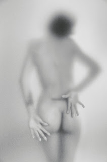
I came across another set of photographs by Gem Fletcher. Again these images depict people behind glass. The photographer has used steam again but he has also used water and a glass texture which distorts the image. The photographs are really minimal which is how i would like to shoot my photographs. The bottom photograph of the three gave me an idea that I will use to develop my work for this project.


Friday 29 November 2013

Gem Fletcher


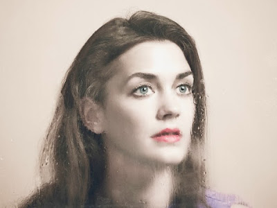
I came across these photographs by Gem Fletcher on Behance. They depict a woman behind steamed up glass. The combination of the steam, the black and white imagery and the positions that the model is in give the photographs a mysterious aspect to them. I think it could be interesting to use something such as steam to distort the photographs that I take behind glass.


Fabrizio Strippoli


I found some photographs that have a similar idea behind them to one of my concepts. They were taken by Fabrizio Strippoli. These photographs use high contrast lighting, dark backgrounds and cold colours which make the images look quite sinister and scary. The faces look creepy and disturbing. I'm sure that this was the idea behind this photo shoot however I intend my photographs to have a much more light hearted feel to them. I would want them to come across with a bit more humour rather than having a scary undertone. 


Wednesday 27 November 2013

eDsanca

I wanted to look at some more portrait photographs that completely defied the stereotypes of portrait photography. I came across a photographer called eDsanca. A couple of his portraits are shown below.


These images are quite shocking but at the same time humorous. He has photographed people who look as if they have been seriously hurt but managed to make the images funny by getting the models to pull stupid faces. The colours on the images are really vivd and this adds to the shocking nature of them. I think these photographs work so well because of that juxtaposition of humour and shock. 

Tadao Cern

I wanted to look at some portraits which completely went against the stereotypical stock portraits that I had looked at when researching existing backing paper. I looked at one of my favourite photographers Tadao Cern as I knew that he often incorporated humour into his portraits. Shown below is some images from a photo set he did called 'Blow Job.'


To create these photographs Cern fired powerful blasts of wind into peoples faces to distort them. The photographs that were taken would have been normal portraits if it weren't for this wind. I would love to use portraits with a slight humorous twist to them within my final pieces as I feel they would capture attention much more than the cliche portraits that are often used on frame backing paper.


Tuesday 26 November 2013

Photo Frame Research


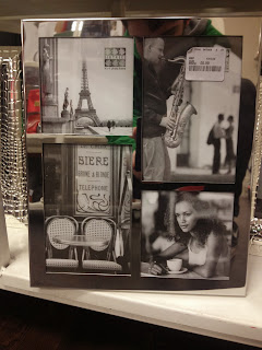
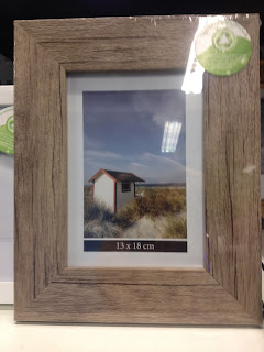
I went into various stores, Clas Ohlson, TK Maxx and Wilkinsons, to look at backing paper designs. I found that the backing paper often changed depending on the style and price of the frame. After looking at lots of different frames I realised that although they were all different images and designs they all either used very simple vector graphics with information about the frame or cliche stock images, very often in black and white. The backing paper usually depicted flowers, repeated prints, groups of people who seemed impossibly happy or images of famous pieces of architecture. Looking at these stereotypical images gave me some ideas. I thought that it would be interesting to completely defy these stereotypes or to make a joke about them.


Wednesday 20 November 2013

Animation Lecture


Shown abobve are some of the notes that I took during the animation lecture this morning. I found the lecture much more interesting than I had originally anticipated. We were given lots of information about the history of animation. We were shown the different forms that animation has taken over the years. We looked at primitive forms of animation such as the magic lantern and the Zoetrope along with a few others and then were told how animation has changed over the years. We looked at some of the animations that we were learning about and it was interesting to see the difference in quality between the animations. I really liked lots of the animations we were shown and the ones I have underlined I intend to sit down and watch in full length as I really liked the small clips that we saw of them. I think the one that I liked most was an animation from 1965 by Chuck Jones called 'The Dot and the Line: a Romance in Lower Mathematics. I have displayed the youtube video below.

Monday 11 November 2013

Typeface Analysis


Gotham is a sans serif, geometric typeface designed by Hoefler and Frere-Jones type foundry in 2000. The typeface came about due to a brief set by GQ magazine to create a custom font for use in their magazine that was 'masculine and fresh.'  Since this brief the typeface has been used in a variety of different places, companies such as coca cola have used Gotham on their packaging and a number of corporate logos now use this very recent typeface. Gotham was probably most famously used in Barrack Obamas presidential campaign. The font was used not only on Shepard Fairey's famous propoganda posters but throughout the campaign on numerous pieces of advertising.


For a typeface that is so current and looks fairly modern, Gotham has its roots in early twentieth century signage. At this time signage was often left to the engineer or draftsmen that designed the building itself. Typefaces were designed solely for their legibility alone rather than following any sort of stylistic agenda. Frere-Jones claims that when designing Gotham he used the mathematical reasoning of a draftsman and often ignored his instincts as a type designer. He allowed gotham to break the grid which gives Gotham an affability that we do not see in other geometric sans serifs. The typeface is much friendlier than any of its Swiss, French or German counterparts and this is one of the things that I like about it so much. The type is still readable and legible, aesthetically pleasing without being decorative or obvious in any way.

Wednesday 6 November 2013

Illustration Lecture


Today we were given a lecture on Illustration. I found the lecture interesting as Illustration is a subject that I am interested in but do not know much about. I assumed that any drawing in any form could be classed as an Illustration but we were told that illustration is 'strategic image making used within the context of visual communication to convey a concept or meaning.' Essentially, for something to be classed as Illustration it needs to have a purpose, it needs to be communicating something. 
We looked at a number of illustrators which allowed us to see a huge variety in the style of practise. I particularly liked work by Saul Steinberg and Steve Powers. Some of the work is shown below.


Studio Brief 5 - Research


I found this poster by Dawid Ryski, a designer and illustrator from Poland on Behance. The thing about this poster that inspired me the most was the strong use of colour. The colours work well together and have been distributed effectively. Another thing about this poster which i really like is the way that there is texture in the design. The design has been screen printed and it could be this process that has achieved this effect. I would like to get a similar texture for my posters based around the bushfires as i feel that a completely flat design with clean edges and block colour would not fit the theme of the posters. I would like them to look slightly distressed to convey the damage caused by the fires.


These posters, based around quotes from prolific musician Kurt Cobain caught my eye immediately. The fluorescent colours are bold and vibrant and work well against the halftone image. The halftone image itself works really well, it looks quite lo-fi and edgy. I may experiment with using a halftone print in my design as I feel it works really well here. I doubt I will use fluorescent inks in these posters however, I do not feel these colours would effectively communicate the message in the way I intend.


This poster (by Pablo Costa) was designed in an attempt to raise awareness about air pollution and climate change. This is fitting as this is part of the message I am trying to deliver with my posters. The use of silhouettes and flat colour with large, bold type works really well and I will think about designing my posters in a similar way. As we are only allowed to use two colours this style of design would be perfect for the project. I also feel that graphics like this are really bold and eye catching which again is perfect for a 'high impact' poster.


I came across this gig poster on Designspiration and unfortunately I cannot find the designers name or any other information about them. I feel the composition of the image is really effective. The eye is drawn all around the page as the design is balanced and considered. I like the texture of the print and the fact that the edges to some of the lines aren't very clean. This imperfection adds to the look of the poster and I would like to try and achieve this with my design. Therefore I intend to screen print it. 


Again, I came across these posters on Designspiration. They are in a format which is similar to the specifications on our brief. They use no image, only type, which is another spec for one of our posters. I like the way the type is lined up, it makes it look like a banner of sorts. Certain words are emphasised depending on the font used and the size. This type hierarchy is something I will have to think about. I also like the stock it has been printed onto. This made me think about the stock and colours that I plan on using. Once again the texture on this design is what makes it and this is reinforcing the idea to screen print my design.