Wednesday 23 October 2013

Semiotics Lectures


We were recently given two lectures based around semiotics. The first lecture was a more basic introduction to semiotics and the second was more in depth. Shown below are my notes from the two lectures.


The simplest definition of Semiotics is 'the study of signs.' However this is a very brief description that by no means covers all the different areas within semiotics. A longer definition that we were given in one of the lectures was, 'Semiotics is the study of signs, sign processes, indication, designation, likeness, analogy, metaphor, symbolism, signification and communication.' This definition offers a much wider view on Semiotics and is more accurate than just 'the study of signs.' 

In the second lecture we looked in more depth at Semiotics. We were taught about visual literacy, which is 'the ability to construct meaning from visual images and type.' As graphic designers this is an important skill to have. visual literacy is the idea that pictures can be read and as designers it is our job to produce these pictures. 

Visual syntax is another area that we looked at. We were told that visual syntax is the visual organisation of elements such as image, framing, format, font, scale, colour, stroke, weight, shape, composition, layout, motion, light, rythm, space, depth, texture, text, words, tone, shade, line, mark, direction, editing, manipulation, simplification, emphasis, layering, heirarchy.
This definition didn't seem concise and even after the lecture I wasn't sure that I completely understood this concept. I looked at the meaning of the word 'syntax.' It is 'the arrangement of words and phrases to create well-formed sentences in language.' This helped me to better understand the idea of visual syntax. It is almost like the visual grammar of an image; if an element is in the wrong place, or non existent, then it can completely confuse the meaning of the imagery. The same way that if there is a word missing or put in the wrong place in a sentence, the sentence will lose its meaning. This theory really interested me and I looked more in depth at how to achieve good visual syntax. My research around this is shown on my PPP blog

Another area we looked at was visual semantics. The semantics of an image refers to a cultural process of communication. It includes the relationship between form and meaning. I had a fairly basic understanding of this theory from the lecture but again I wanted to look at it in more depth. I watched a talk by Molly Holzschlag, an author, lecturer and web designer from the U.S, about visual semantics and this gave me a deeper understanding of the concept. The link to the video is shown below.


Visual Semantics includes the ideas that colour and shapes have meaning and communicate differently to different people depending on their culture. One of the example Holzschlag gives is that in America the colour green can denote money whereas in Australia this does not work as the money is not green but a huge variety of shades. This is only one example,  she spends time talking through the meanings of colour and how even the shade of the colour can drastically change the connotations.

Another area we looked at was Visual Synecdoches. This term is applied when a part is used to represent a whole. For example the term 'all hands on deck' utilised a visual synecdoche. Referring to people as 'hands' trivialises the other aspects of that person, it focuses on the thing that is useful in the situation. In the same way we may refer to academics as 'brains.'

We also looked at Visual Metonyms and Visual Metaphors. A visual Metonym is a symbolic image used to reference something with a more literal meaning. For example a cross may be used to signify the church. A visual metaphor is similar to a metonym in many ways however there are some significant differences. When using a metaphor you substitute something that has similarities to the thing you are talking about for the thing itself. Whereas in a metonym you substitute something that is derived directly from the thing, such as an effect or cause of it, for the thing itself. 

Tuesday 15 October 2013

AType (research)


The work displayed here was created by a designer who goes by the name of Lobulo Design. The letters were made by manipulating paper and card in various different ways. The outcomes when photographed look really nice. The type is obviously 3D and the shadows created are effective. It makes the letterforms look more tactile than when shown on a screen. I may look at crafting paper to make up letterforms in a similar way to this

Kokoro & Moi (research)


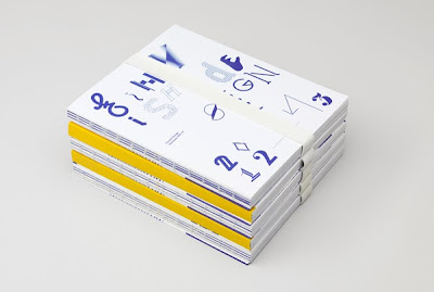
I came across this work by a creative agency in Finland called Kokoro & Moi. The publication displayed above showcases a typeface named 'Yo Freckles.' The typeface was intended to be playful. It would not work as body copy but it was intended as a titling typeface and i think in this format the combination of variety in the letters could be really effective. I was worrying about making sure that my letters work as a set before seeing this. This project made me realise that letters don't all have to take really similar forms to work well together.
Each glyph within this typeface was designed by somebody different as the project was intended to bring open design and collaborative design to typography, something which is not often done. Looking at this typeface really inspired me as each character gave me new ideas of how to play with the way certain characters are formed.


OUGD401- Savile Lumley advertisement and Shumacher & Eutlinger advertisent comparison


Savile Lumley (1915)


Schumacher & Eutlinger (1876)


The propaganda poster designed by Saville Lumley in 1915 was aimed predominantly at young men. World War One was being fought at the time and the poster is attempting to persuade them to join the army. England being at war was obviously having an effect on the economy and on the general population. The poster shows a time in the future after the war, it depicts a man sat with his children. The text reads  Daddy, what did YOU do during the Great War?' It is promising men a future that looks idyllic, which is very likely they may not have if they go to war. This future must look incredibly appealing comparend to the way they were living during war time Britain. 
From the image it looks as if the text at the bottom of the poster are the words of the young girl. It is trying to guilt trip men into enlisting, making them think about what they will have to tell their children about their life during the war. If they have not fought they would look like cowards. 
Although the image is advertising something directly related to the welfare of the country it has only attempted to employ National pride in small subtle ways whereas the 'Uncle Sam Range' advertisements from America are the opposite of subtle. The imagery used is obviously trying to appeal to the American public's national pride. The 'Uncle Sam Range' advertisements were designed by Shumacher & Eutlinger in 1876. Appealing to people's patriotism was a fairly obvious way to catch peoples attention at the time as the American Civil War had ended just 3 years before. This was a time of great national pride, not only because of the recent victory in a long fought war but because of the very recent rise in industrial growth. 1876 was the year considered the beginning of the rise of industrial America. It was the year America first emerged as an industrial giant, jobs were created and affluent middle-class was produced. All of these people prospered from these changes and received a better quality of life.
The style of Illustration in both of the advertisements is very similar but the actual content and also the typefaces used are quite different. The Savile Lumley poster uses fairly normal, neutral colours whereas the Uncle Sam Range advertisements use bright patriotic colours. The propaganda poster uses a script typeface and fairly small type. It is much more reserved than the typeface used in the Uncle Sam Range advertisements. The type in this image looks very American. Again referring back to the patriotic intent to the piece. It is a large element of the piece taking up the lower third of the image. It is bold and the U and the S in the words 'Uncle Sam' are set in a larger type than the rest of the letters, once again this also shows patriotic pride with the initials U.S being highlighted. 
We can see some patriotic imagery in the Savile Lumley poster. Red roses, a symbol of England can be seen on the curtains and the young boy in the image is playing with Beef Eater toys, also an Iconic british symbol. As I have stated previously, the references towards patriotism are much more subtle than the ones we see in the Uncle Sam Range advert. I believe this shows a difference in the mentalities of the British people during world war one and the Americans in the years following the civil war. The British people are much more reserved and modest than the Americans. 
The Uncle Sam Range advertisements include imagery that backs up this statement. It shows a black slave serving them which at the time was accepted, but was blatantly immoral and cruel. This being shown on the advertisements shows that this aspect of their society is something they are proud about, despite the cruel nature of it. Also visible in the image is what looks like a menu listing countries and listing the food America can provide for them. I believe the image shows America inviting the world to their table. Not only is this condescending and shows how dominant the Americans believe themselves to be to the rest of the world, but it also shows signs of racism. The foods they list under countries names are incredibly stereotypical. For example, underneath Ireland various types of potatoes are listed and nothing else and underneath China there is strange things such as rats and birds nests. 
I believe that these posters show very interesting differences in the mentality of the general public during the times they were both released. However there are also some apparent similarities. 

Friday 11 October 2013

Designspiration Research


I spent some time on Designspiration browsing through pieces utilizing type as their main element. I came across numerous examples. The pieces I have shown here are just a few of many I found. The reason I like these 3 pieces is because they are all two dimensional and all use one colour. I want my designs to be in a similar format to this. I feel it makes the bolder, simpler and overall more effective. 

Wednesday 9 October 2013

LCA Prospectus analysis


The first impression you receive from the LCA prospectus is a good one. The designers have utilised foil blocking on the front, making the cover stand out straight away. It gives the book a high end look and would immediately grab your attention. However almost straight away this first impression is ruined. The use of the semi-transparent polygons that start on the first page and continue throughout the prospectus, don't sit well with the large bodies of text that are used on many of the pages. They are not only distracting but look out of place behind the horizontal text. They fragment the page and I feel make the composition unbalanced.
The back page has a large area of whitespace. This can be a strong element of some designs but in this case it looks like it is missing something. There either needs to be some text or the pattern needs to cover the entire back cover.
On some of the first pages, we also see a cream border surrounding an off white page. The colours don't contrast enough for this to be effective. If I were designing it I would either use a bolder colour for the border or leave the page without.
The layout of the prospectus is consistent, with a line splitting up each page and text and images sitting across either one or two of the columns. I personally would have used 3 columns at least as I feel it would give more scope for variation. But the 2 column grid still works well and is legible. I also like the way that even on pages without large amounts of text they have still put in some sections of the line to keep the same format throughout. 
Although this nicely balanced layout is used in the majority of pages in the prospectus, there are a few pages which go against it and look awful. Images seem to float in random spaces on the page, not lining up with anything. On top of this, the images are all random sizes, which again ruins the consistency. These pages make the prospectus look rushed and unprofessional.
The prospectus has been printed to a high quality. I have already mentioned the foil blocking but the paper stock feels as if it is high quality, the images used are crisp and the colours are vibrant. 
Overall the prospectus has been designed fairly well in my opinion. It has been ruined with a few mistakes and with some slight changes I feel it could be an aesthetically pleasing publication

Tuesday 8 October 2013

Type Basics Workshop


We did a workshop looking at the basics of type to give us a better understanding of the way type works and the terminology we need to know to be able to talk about our work. 
We looked at typographic terminology such as the x-height, the baseline, bowls and more (shown in image of sketchbook) and the meanings for all these things. 
We also looked at line weights and the difference in this depending on the style of typeface. Sans Serif typefaces for example usually have a very uniform line weight. 
Alongside this we also briefly looked at classifications of typefaces. Going into more depth than serif and sans serif. I found out that Futura, the typeface I have been assigned for this project is classed as a geometric sans serif font. 
To test out our knowledge and to try and get us using the terminology we had been learning about we did an exercise changing sans serif fonts to serifs and vice versa. I feel actually making this transformation made the differences between these two categories really obvious and I now feel I have a better understanding of type. I intend to go away and read some books about type that were recommended in the session.


Monday 7 October 2013

5 pieces of Inspiration


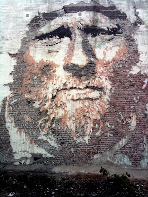
Alexandre Farto A.K.A Vhils is a prolific street artist originally from portugal. His distinctive pieces have been popping up all over the world. The desire he has to get his work out there is something that I really admire. Vhils creates detailed portraits by drilling away plaster and brickwork to show different areas of tone. This unusual method is something that i find really interesting and is one of the reasons I like his work so much. He also produces work off the streets which utilises collage, stencils and various experimental processes which I have taken inspiration from in the past, for art and for Graphic Design.


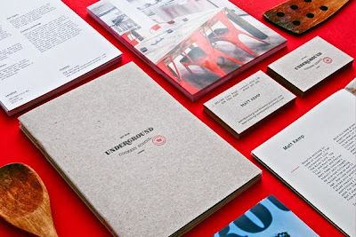
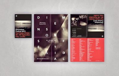
Above is the work of Notting Hill based design agency Two Times Elliott. Two Times Elliott work across many disciplines but their identity design and design for print is the area of their work that I like the most. The work is always to a really high standard, a lot of the time quite minimal but never boring. The agency always seem to have a concept behind their work and I think the fact that they focus on ideas means that they don't produce shallow design. The work is always visually interesting and I think this is down to them being precise during every aspect of the design. Their composition is always eye catching yet legible, the design never seems unbalanced and they always ensure their print work is done to a high quality. I have taken lots of inspiration from Two Times Elliott since I came across their work last year and look forward to seeing their next project.


Mother is an Advertising agency based in London. Although I understand that Mother are an advertising agency, not artists or designers I wanted to show some of their work as I really like the personality that comes across. There is tongue in cheek humour which is done really cleverly a lot of the time. Obviously they also produce advertisements with a more serious tone but the work I have shown here is light hearted. The top two images display what Mother called, the uncarriable carrier bag. Its intention was to make people think about the overuse of plastic bags and how much they actually need to use them. The way they have approached this is intelligent and funny which i feel is really effective across all forms of visual communication. I have also shown an advert for 'Talk to Frank' which uses a play on words to get the intended message across. The attitude Mother have and how they approach many of their projects is the main selling point of this agency for me.


Josef Muller-Brockmann was a lead practitioner and theorist of the Swiss Style, also known as the Typographic Style. His ideas on design influence designers to this day and his grid system is still recognised as extremely effective and often still adhered to. I love looking at Brockmann's work, the way it is so effective whilst being so minimal is something I would love to emulate. His use of photography with simple type is something that he does incredibly well and I have taken inspiration from this in the past. Not only do I admire Brockmann for the influence he has had on design but I find it amazing that his work doesn't look dated. Considering much of it was designed in the 50's I think thats quite a feat and shows that he had a brilliant understanding of design.


Sam Chivers, an Illustrator from Brighton produces some of my favourite pieces. He uses CMYK screen printing for all his prints which is a highly skilled process. However the processes he uses are not the reason I like his work so much. The pieces are always vibrant with well thought out colour schemes and excellent composition. I am never quite sure what his work depicts, it is always quite open ended and up to you to use your imagination. This is one of the things that I like most about his work. Chivers must have an incredible imagination himself to come up with such strange ideas and images. 


Futura Research


I did some research into Futura as I felt it was important to have some knowledge of the typeface before I started the project. I looked at a number of sources to get the information that I wanted to find out but the most helpful by far was idsgn.org
Futura was designed between 1924 and 1926 and was released in 1927 by Bauer type foundry. It was designed by Paul Renner, a German graphic artist, type designer and painter. As well as Futura, Renner designed the well know typeface Plak.
Renner designed Futura with the Bauhaus design philosophy in mind. Putting function over form and avoiding any non-essential elements. This has resulted in an incredibly simple, minimal typeface.


Futura is a massively popular font. Shown above are just a few examples of Futura in use. As you can see some huge companies have used the typeface in their logo. Futura was even the typeface used on the historical plaque that was placed on the moon in 1969 by the  astronauts of Apollo 11.


Sunday 6 October 2013

Research


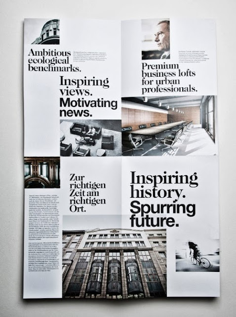
I stumbled upon this piece of work on a design blog called print.pm. It displayed this image and thats all and I have been unable to find any information about the designer. The design of this really inspired me though, I like the way that the page is really fragmented with different size and style type spread around the page with photographs of different shapes and sizes in between this type. Despite this fragmented design the piece flows really well and I hope to take some inspiration from this for the design of our piece for the Introduction brief

Friday 4 October 2013

Sidney Lim Yi Xiang


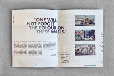
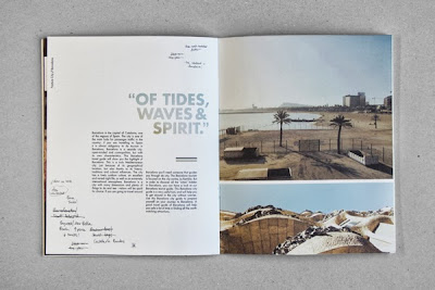
This layout was put together by a designer named Sidney Lim Yi Xiang. What stood out to me in the design of this was the effective combination of image with small bodies of text. The images on the stock that has been used look really nice and I think this will be something I plan to use in my groups work, an off white, fairly heavy stock to make it seem more high end and important. I like the use of a bold sans serif typeface in upper case as the titles and quotes. It really helps them to stand out.  


Freshers Guide (Research)


The group spent time researching and came across this guide. It is designed for Freshers in Leeds and therefore has the same target as we do. The legibility and simplicity of this piece is something that our group took inspiration from. The layout is balanced and simple while at the same time remaining visually interesting. We plan to achieve something similar to this with our piece. Although we have decided against a booklet the way this one has been designed will inspire our work.


Tuesday 1 October 2013

Research


The design of this guide to a film festival in Singapore really stood out to me. I feel it will influence the design of the handout we are making for freshers in the 'How to...' project. It was designed by Anonymous, a design studio based in Singapore. The use of grids and columns makes the composition of each page really balanced. I like the way they have used a simple sans serif type for the title and then black copy against a white background for the body text. It makes it really functional and legible. I want a minimal yet well designed look to the piece we are creating as i feel that it will help to make the student work we will be displaying stand out.