Thursday 14 January 2016
Sunday 17 May 2015
Practical Research

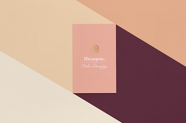


Shown above are a number of images that inspired my ideas for the design of the practical outcome. I had two criteria's for the design of the certificates, ease of use and an official, high end aesthetic. These documents are used for official purposes so ease of use is important due to the number of people who will be accessing the information. I wanted the certificates to have a high end aesthetic as they would be kept as keepsakes. I also wanted a continuous aesthetic to run throughout the designs but a slight change in colour to differentiate between each certificate. I considered using colours of the sun and sunsets as I felt this fit conceptually with the idea of life.
Wednesday 6 May 2015
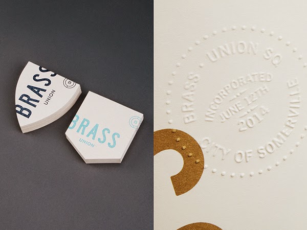
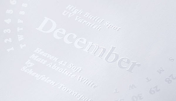
Print Finishes
As my essay tackles the issue of traditional print processes I wanted to ensure that I used at least one specialist finish within my practical work. I looked at various pieces of work that use embossing, foiling and spot varnishing.


Monday 4 May 2015
Giacomo Gabrielli Healthcare forms

Shown above is a project that I came across on Behance when I was researching for my initial idea to redesign healthcare forms. This has been really helpful with the design of the birth, marriage and death certificates. I want my design to be slightly more stylistic than this but the functionality of this design was something I have been trying to relpicate. Giacomo Gabrielli's strong use of grid, utilisation of colour tints and clear type hierarchy have all informed my own designs.
Saturday 2 May 2015
OUGD501 - Physical COP outcome Idea
I spent a lot of time considering different outcomes for the physical part of my Context of Practise brief. I wanted to redesign something that legally has to be printed as my essay is about the relevance of print design in the modern day. I considered redesigning NHS medical forms but found that it was difficult to get my hands on these without actually being ill. When I did see a sample form I realised that the design already fit the purpose. Obviously there were improvements that I could make but not enough to warrant a complete redesign. I also looked at diabetes log books but after speaking to a nurse at my local practise I discovered that the majority of patients keep track of their insulin levels digitally, which completely goes against the whole purpose of the project.


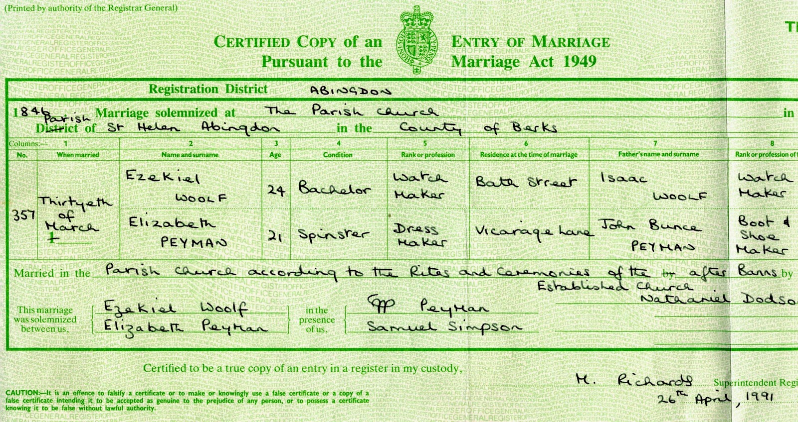


A friend suggested looking at birth certificates and this led me on to looking at marriage and death certificates also. The design of all of these was absolutely dire and a complete redesign would make sense. Names for the project such as life on paper, life in print and life documents sprung to mind. I feel this has a lot of potential to be a really nice project.
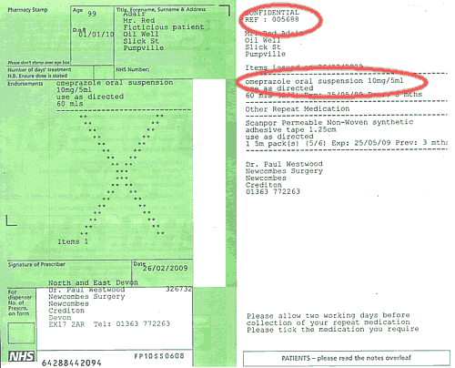
I also considered looking at redesigning driving licences and prescription forms as part of the project. I am unsure whether to include them or not, I feel it may unnecessarily complicate the project.
Monday 10 November 2014
OUGD501 - Study Task 03 - Forming a Research Question
I spent some time thinking about my research question and how I will form this into a project. I started by answering the questions provided to us.
What is the general theme?
Printmaking and traditional design processes.
What are the current/contextual/historical issues of the general theme?
What do I want to know or be able to do in regard to this theme? Form this into a question that implies a conclusion...
I want to explore how relevant the use of traditional print processes is in the modern day design industry and whether these can be incorporated into UX design and design for web.
I also want to look at how these processes are becoming more fashionable, for example sign painting.
How does this relate to my (increasingly specialist) practice?
Design for Print is an area which really interests me and I personally want to start exploring the use of some of these processes in my own work. I feel that this project will help me gain a better understanding of traditional processes and give me scope to experiment with them.
Is there value in the use of traditional print processes in an increasingly digitised world?
What is the general theme?
Printmaking and traditional design processes.
What are the current/contextual/historical issues of the general theme?
- 'The death of print'
- Use of computers within design (Graphic Artist/ Graphic Designer)
- Increasing use of 'pastiche' in modern design.
What do I want to know or be able to do in regard to this theme? Form this into a question that implies a conclusion...
I want to explore how relevant the use of traditional print processes is in the modern day design industry and whether these can be incorporated into UX design and design for web.
I also want to look at how these processes are becoming more fashionable, for example sign painting.
How does this relate to my (increasingly specialist) practice?
Design for Print is an area which really interests me and I personally want to start exploring the use of some of these processes in my own work. I feel that this project will help me gain a better understanding of traditional processes and give me scope to experiment with them.
Is there value in the use of traditional print processes in an increasingly digitised world?
OUGD501 - Seminar 3/11/14
In The COP seminar yesterday we looked at a few different theories, primarily Deconstruction by Jacques Derrida and Pastiche by Fredric Jameson.
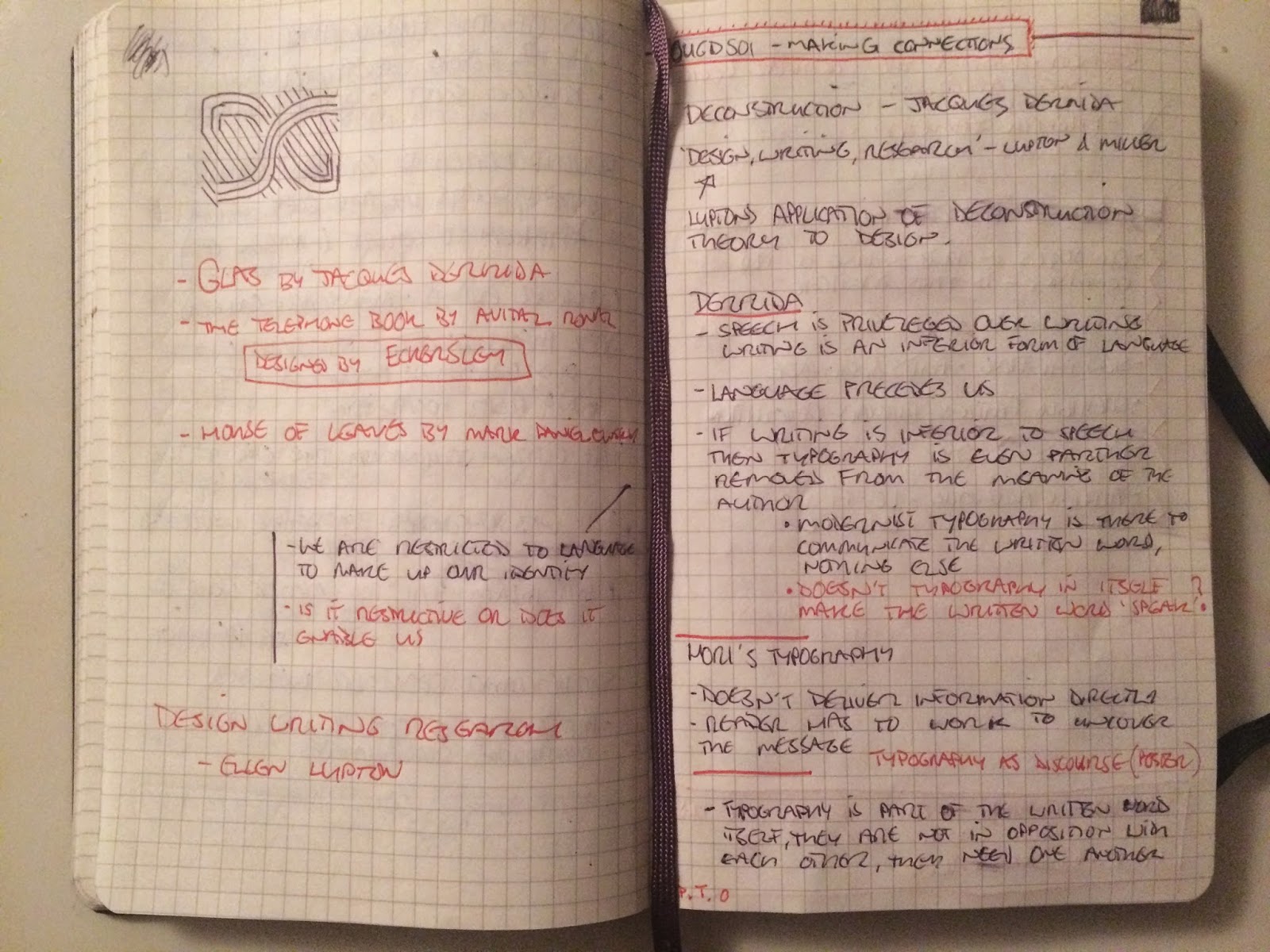
We started by looking at Derrida's theory of Deconstruction. This theory evolves for Structuralism and Post-Structuralism theories in the 70's and 80's. The understanding I gained of this theory is fairly vague and after researching further into it I realised how deep this theory goes. It applies to a vast range of subject areas but in this session we looked into the way this theory applies to Graphic Design and Art (especially Ellen Lupton's writing on this.)
Derrida believes that in western society we have a tendency to ‘create dualistic oppositions.' For example speech and writing, presence and absence or mind and body. Derrida says that we often create a hierarchy between these oppositions which privileges one over the other and his writing questions these assumed hierarchies. Derrida believes that these hierarchies are superfluous, each dichotomy needs the other to exist. For example, for there to be presence, there needs to be absence. Or as Lupton puts it ‘Deconstruction attacks such oppositions by showing how the devalued [...] concept inhabits the valued...’
One of the oppositions that features in Derrida's writing is between speech and writing. He writes that we value speech over writing; ‘speech draws on interior consciousness, but writing is dead and abstract’. We looked into the way that this applies to typography and some examples of work which try and adhere to this theory.


The second theory we looked at was Fredric Jameson's theory of 'Pastiche.' I found this much easier to grasp than the theory of Deconstruction. Although I don't necessarily agree with Jameson's theory I can see where he is coming from and the points he was trying to make with his writing. Pastiche is essentially a piece of creative work that imitates another practitioner or another period in History. Fredric Jameson is a Marxist Political critic, essentially an anti-capitalist. He says that 'postmodernity has transformed the historical past into a series of emptied-out stylizations.' Essentially the re-appropiation of historical visual styles causes us to lose touch with history and provokes a fascination with the present. This is turn means that these visual styles are commodified and consumed, which in itself enforces capitalist thinking.
Personally I don't believe that this necessarily a bad thing. Isn't progression made by taking things from our past, altering them and combining them. Nothing is every truly original and I don't think everything should strive to be modern and new. There is so much valuable material from the past and I believe it would be ridiculous let all this fall into the confines of history. These visual styles can be used effectively in the modern day and personally I think they should be used.
